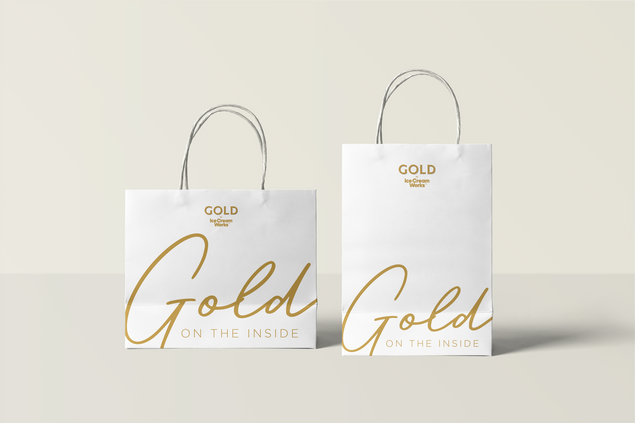

Gold by
ice cream works
Copywriter
[Brand Identity] [Packaging Collaterals] [Menu Copy]
At Yellow Creative Agency
Luxury Ice Cream and Desserts
The Brief
Ice Cream Works, an up-and-coming fun ice cream brand is coming out with its much grander Gold series.
The Brand
Gold by Ice Cream Works is extravagance turned up to 110. Every single ingredient and flavour is sourced from various corners of the world and leaves no stone unturned. With a really refined and strong product on our hands, our primary task was to not only do justice to it but also capture its larger-than-life-ness. Gold by Ice Cream Works is unapologetic indulgence.
Right from the name to the design of the tub, Gold was a central theme to all our ideation and communication (as it should be). The flavours were actually quite unique and not something widely available in the market. So, they required names that were equally larger than life.
The brand is not your run-of-the-mill ‘elegant’ luxe food brand but a rather ‘kick the door down on its way in’ food brand. When you see it, you can't ignore it.


All of this goodness was going to be served at its very own café in Bandra where it used its exquisite ice cream as ingredients in creating some delectable desserts, essentially the ‘Gold’ experience. The desserts you get outside may be lacklustre or dull, but here they’re indulgent and proud.
The brand also has a dedicated guiltfree range, that's lighter on your calorie wallet while maintaining the same taste.
Gold by Ice Cream Works takes great pride in transforming each spoonful into an experience that awakens your palate - well after all, all that glitters is gold.
The Copy
The language of the brand is a reflection of the it’s larger-than-life nature. The tagline ‘all that glitters is gold’ actually sets the tone for what you’re in for. It’s not looking to be understated or underwhelming and hence comes in all guns blazing whenever it needs to drive a point home.
This extended onto the product names, the menu, the social media and also its own physical café. It offered me a chance to work on a high-end brand that’s not too interested in selling itself short.
The menu was another fun challenge. A lot of consideration went into the layout, the flow as well as the economy of words since we had to create something that was scannable yet tells you enough to compel you to try it.
The beginning of the menu takes a couple of pages to tell you the story of Gold and the origin of various ingredients around the world, be it vanilla from Madagascar or single origin cocoa from Ecuador. These exotic ingredients were a really nice differentiator for the brand and really deserved some space of their own.
The kids menu was presented as a separate menu of its own with a children's book theme to it, just like the dishes. After its launch, the kids menu became a hit amongst the younger crowd coming to the cafe.
Ice cream is an indulgence and when you take that extra step to make something special, the audience does appreciate and reward it.


