
g.m.
syntex
B2B Home Textile Manufacturer
Copywriter + Production and Creative Direction (Video)
[Brand Identity] [Brand Video]
[Packaging Collaterals] [Website Copy]
[Creative Direction (Video)]
At Yellow Creative Agency
Press: [Branding in Asia]
The Brief
One of India’s top 4 B2B home textile fabric manufacturers wants to rebrand to create a presence in today’s time.
The Brand
G.M. Syntex was already a quite established brand within its space, with an operation spanning 45+ countries and a facility sprawling over 1.2 million square feet in Tarapur, Maharashtra. What it needed was uniformity coupled with focused messaging.
As the agenda and the messaging were crystal clear, it helped us focus our efforts in one specific direction. In times like these, that’s quite a luxury.
G.M. Syntex Factory Tour, 2024
Role - Creative conceptualisation, video flow and production

G.M. Syntex Dip Dye Process, 2024
Role - Creative conceptualisation, video flow and production
This rebranding exercise was the start of a company-wide endeavour to bring the brand to the 2020s and beyond.
We wanted to harness the brand’s thought leadership within the space and help it actualise its gentle giant-like characteristics. The feeling we wanted to invoke on behalf of the brand was 'We know who we are, we know what we’re doing' — the audience must feel this in every interaction.
Another challenge that needed to be addressed was uniformity, with an operation that spread out, pulling everything back together and reworking it was quite the task.


The result, one of the more crisp and clear brands present in their industry today. One of the rare cases where the ‘want’ trumped the ‘need’.
The Copy
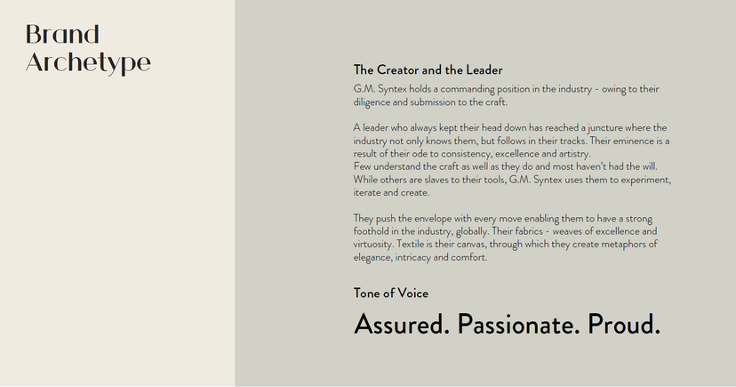
The brand's archetypes are the creator and the leader, and these were one of the 2 main characteristics that the founders resonated with the most.
This roughly paved out the way for some simple, descriptive (when needed) and light copy. The copy alone doesn’t do a lot, but when it sits next to the images and the design, something just comes together in a neat package.
I did take some liberties with the vocabulary wherever I could, since there are some parts of the brand that require simple straightforward messaging alongwith other parts, that could do with some dreaminess.


The Website
The purpose of the website was to establish an online presence for the brand, which was missing before. The design and copy are an extension of the brand's tonality and are meant to provide value to their B2B clients and prospects across the world.


